The Marble Shrine: DS
The marks, tokens, and type that everything on the site is built from. For the components, see the style guide.
Sigil
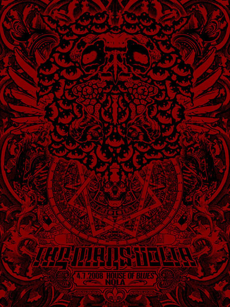
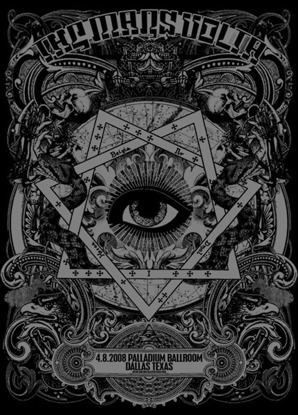
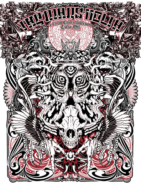
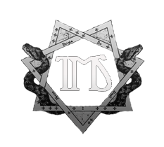
The upside-down heptagram, a seven-pointed star woven through a masonry ring, is the logomark. It traces back to Jared Connor (Mexican Chocolate), the artist behind more than half of The Mars Volta's posters and a friend of The Marble Shrine, and three specific posters he created for 2008 shows.
We pulled the heptagram out of those posters and, over the next eighteen years, carried it through three versions of the site's logo. Jared even animated a gif for us when we were first launching the site (see below), and we've used elements of it throughout the years.
The source posters
Three Mexican Chocolate posters for The Mars Volta, April 2008 (two collaborations with Alan Forbes). Click to open full-size.

Three logos, eighteen years
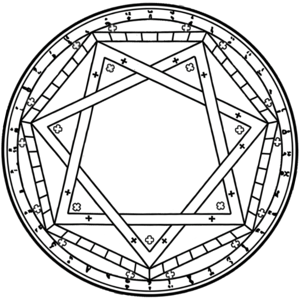
The 2026 sigil, in code
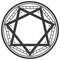
The current mark is generated. The ring, the {7/2} star, the over-under weave, and the seven tipped crosses are all computed from a handful of constants. One file does the whole job: it scales cleanly from a 16px favicon up to a billboard with no raster exports and no pixelation, re-inks itself for light or dark mode from a single color value, and can animate its own strokes. Everything below is rendered from that same component.
Getting there
Rebuilding it in code took a while to feel right. A few stages along the way:
Animation studies
A computed mark can draw its own strokes on. Some entrances we tried, each rendered live from the component (hover to replay):
Scale: sigil
One vector, every size. Same file:
Scale: logomark
The full lockup, composed from the same vector sigil + wordmark, stacked at increasing sizes. Inks with the theme, like everything else:
Color
Warm near-black and warm off-white make up the marble palette. Never pure black or white; no decorative accent (the accent is a neutral marble grey). Every token has a mirrored value in the other theme. to see the other set.
Surfaces
Ink
Recording sources. Fixed archival hues, the one exception to theme tokens.
Typography
Three typefaces, no fourth. There is deliberately no sans-serif; where you'd reach for one, we use Spectral.
The Marble Shrine
The Bedlam in Goliath
Documenting the live history, show by show.
All three are open-source (SIL Open Font License) via Google Fonts, self-hosted from our own server (no third-party font requests at runtime).
Headings
--font-display · --fs-3xl · 600--font-display · --fs-2xl · 600--font-display italic · --fs-xl · 500--font-display · --fs-lg · 600.eyebrow · --fs-2xs · --track-labelBody
Lead paragraph. A larger measure for the first line of a section; it sets the reading rhythm before the body proper.
--font-serif · --fs-lg · 1.7 Body. The default reading size for prose across the site: setlist notes, liner notes, descriptions. Spectral at 1rem with generous line-height keeps long passages legible.
--font-serif · --fs-md · 1.7 Secondary. Captions, meta, and sub-text: muted and a step down.
--fs-sm · --muted The scale
| Token | Size | Role |
|---|---|---|
--fs-3xl | clamp(2rem, 4vw, 2.6rem) | Hero heading |
--fs-2xl | 2rem | Page heading (h1) |
--fs-xl | 1.4rem | Section heading (h2) |
--fs-lg | 1.15rem | Subheading / lead |
--fs-md | 1rem | Body |
--fs-sm | 0.88rem | Secondary body |
--fs-xs | 0.78rem | Meta / captions |
--fs-2xs | 0.68rem | Eyebrows / labels |
Leading
Four line-height steps. Headings ride tight; reading text rides relaxed.
The Bedlam in Goliath was recorded on a ouija board's logic, and the leading you set decides whether a passage breathes or crowds.
--leading-tight · 1.15 · headings The Bedlam in Goliath was recorded on a ouija board's logic, and the leading you set decides whether a passage breathes or crowds.
--leading-snug · 1.3 · subheads, UI The Bedlam in Goliath was recorded on a ouija board's logic, and the leading you set decides whether a passage breathes or crowds.
--leading-normal · 1.5 · dense body, captions The Bedlam in Goliath was recorded on a ouija board's logic, and the leading you set decides whether a passage breathes or crowds.
--leading-relaxed · 1.7 · reading body Tracking
Letter-spacing. Uppercase labels open up; large display type pulls in; running text stays neutral.
| Token | Value | Sample |
|---|---|---|
--track-label | 0.14em | Eyebrow label |
--track-chip | 0.06em | Chip |
--track-tight | -0.02em | The Marble Shrine |
--track-normal | 0 | Running text stays neutral |
Weight
Four weights across the three faces. Display type stays 400–600; 700 is for names and strong emphasis only.
--fw-normal · 400 --fw-medium · 500 --fw-semibold · 600 --fw-bold · 700 Show pages add a per-era display face, a self-hosted type system that shifts each page's character to the record it documents. It's the one place the type leaves the scale, on purpose.
Space & structure
A 4 / 8px rhythm. Section spacing uses full steps; component interiors use half-steps (--sp-1h … --sp-4h).
--sp-10.25rem --sp-20.5rem --sp-30.75rem --sp-41rem --sp-51.5rem --sp-62rem --sp-72.5rem --sp-83rem Radius
--radius-btn2px --radius-card6px --radius-pill999px Border width
Layering
Named z-index layers, so stacking order is legible instead of magic numbers.
--z-sticky · 20 --z-header · 50 --z-adminbar · 60 --z-player · 80 --z-drawer · 90 --z-overlay · 95 --z-toast · 100 Assets
The sigil and the full logomark lockup, as vectors and white-on-transparent PNGs, plus the motion kit (4K ProRes with a real alpha channel, and the lossless frame sequence).
Logomark lockup


The style guide
Every element built from these tokens (buttons, chips, cards, inputs), live-rendered from the real code.